What is QSkinny?
QSkinny is a UI framework based on the Qt graphic stack and written in {cpp}. It allows users to write their UIs in {cpp} and/or QML.
The Fendt Tractor GUI
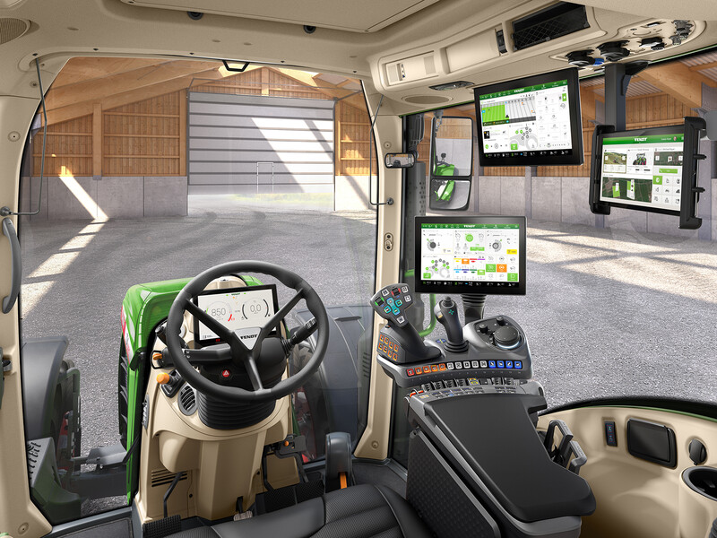
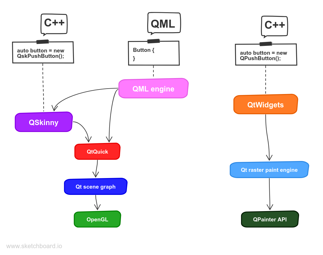
It is currently being used in the Fendt Tractor GUI project, see the picture above. For the Fendt Tractor GUI there is no QML used at all; the whole codebase is written in {cpp}. An overview of how QSkinny fits into the Qt architecture is depicted below:
QSkinny sits on top of QtQuick, while QML is optional
Why QSkinny?
The typical questions about QSkinny are: Why was QSkinny created? And why would somebody use QSkinny and not QML?
Which technology to use always depends on the specific use case. However, QSkinny does have some advantages:
1. It's C++
QSkinny is written in C++, so there is no new syntax or programming paradigm to learn as is the case with QML. Of course QSkinny has concepts that new programmers need to become familiar with, but they should be understandable for people who know C++. Especially programmers experienced with QtWidgets should feel comfortable with QSkinny right away.
1.1 Integration with other build systems / IDEs
While QtCreator is the natural choice of IDE for Qt programmers, some people prefer other IDEs, e.g. Visual Studio (Code), Eclipse, CLion etc. Such IDEs usually don’t have language support for QML like type completion and other features. So when using QML you are either bound to using QtCreator, or use another IDE and live with the fact that the IDE will not understand QML.
When it comes to build systems, some QML tools might be hard to integrate: For instance in Visual Studio projects it is difficult to invoke the QML compiler through the build system.
With QSkinny being written completely in C++, it can be used with any IDE and should integrate nicely with other build systems. QSkinny is using Qt-specific concepts like signals and slots and invokable methods though.
1.2 Use C++ tooling for your whole codebase
C++ has extensive tooling that assists with writing code, for instance:
- gdb and other debuggers
- valgrind
- address sanitizer and other sanitizers
- static code analysis tools
- code coverage tools (e.g. gcov)
- auto test frameworks
- (a lot more, e.g. clang tools)
E.g. QtCreator will let you know about potential problems in your code while you type, e.g. "unused variable", "calling a virtual method from the constructor of a class" etc., and it might even suggest an automatic fix for it.
QML does have some tooling, but its feature set is nowhere near the support of C++.
When writing your whole codebase in C++ with QSkinny, the tooling can be used for the whole codebase, so also UI code can be debugged, auto tested for a CI system, and so on.
In addition, C++ has concepts that QML as a declarative language doesn’t, like inheritance and overloading. This makes it easier to implement concepts like event handling, see Styling below.
2. Easy data binding
When displaying data from a backend in a QML UI, that data needs to be in a certain format: It needs to be made readable by Qt’s Meta Object system via Q_PROPERTY, Q_INVOKABLE, Q_SIGNAL and others.
Also, for each model that is used in QML there typically needs to be one subclass of QAbstractListModel, which serves as an adapter class. The process of subclassing and implementing virtual methods can be cumbersome, and lead to lots of boilerplate code.
QSkinny doesn’t need any adaptation layer per se, the data just needs to be connected to the frontend with standard C++ functionality. Of course classes like the aforementioned QAbstractListModel can be used when it makes sense, but this is up to the user.
3. Layouts
Whe it comes to layouts, QSkinny has a complete concept of laying out the UI, or in other words: The user can determine in a fine-grained way what happens when there is too little or too much space available. Concepts like size hints, size policies, stretch factors and others are concepts that were already available in QtWidgets and Qt’s Graphics View Framework, and are now supported in QSkinny.
Why are layouts important? QML was created under the premise that in contrast to desktop UIs, embedded UIs run as fullscreen window on an embedded board and thus size changes will rarely happen.
This is true for many cases, however layout code gets important when one of the following events happen:
- The UI needs to run on two or more screen sizes
- Language or style changes need to be supported
- The window is resized, e.g. when the Android virtual keyboard pops up
QSkinny allows the user to take the above use cases into account, but doesn’t force the developer to write overly complex code: A UI written with QSkinny can be coded with fixed sizes for UI elements, as it is typically done in QML.
4. Styling / Adding custom controls
Qt Quick Controls 2 support different styles, and it even comes with several built-in styles like a Google Material style and a Microsoft Universal style.
One drawback with Qt Quick Controls 2 is that application developers can only add custom types in QML, not in C++. This makes it cumbersome for concepts like event handling, as is noted in the Qt documentation: Differences with Qt Quick Controls 1.
So an application developer who wants to add own types, as is common for medium to large-scale projects, will have to implement these custom types in QML. Since being able to use C++ for application logic of components seems to have been one reason to create Qt Quick Controls 2 (another reason apparently being performance issues with Qt Quick Controls 1), allowing the user to write controls in C++ gives the user more flexibility.
QSkinny allows for implementing custom types in C++; also both built-in components like push buttons, sliders etc. as well as custom types can be easily styled from C++. The latter can be achieved by simply adding style descriptions in user code.
Writing your first application
Building the QSkinny repository
In this chapter we will write a simple QSkinny application on Linux from scratch in C++ with Qt6. As a prerequisite, a supported Qt6 version should be available.
On debian bullseye we need to install these packages build-essential cmake qtbase6-dev qtbase6-private-dev qtdeclarative6-dev qtdeclarative6-private-dev libqt6svg-dev qt6-shadertools.
Optional packages for the virtual keyboard are libhunspell-dev libimepinyin-dev
Then we can build and install QSkinny to /opt/qskinny with the following commands:
Considering that you want to use a specific Qt version that is installed below "/path/to/qt" you have 2 options:
or
Compiling our first app
As a next step, we need to write our app. Let’s start with a simple main.cpp file in a directory myapp:
main.cpp
For now this will just create an empty window (the QskWindow) without any controls. Next, we need to create a CMakeLists.txt file in our myapp directory.
CMakeLists.txt
Now we can compile our app:
When running myapp it needs to find the skin plugins. Setting QT_PLUGIN_PATH is one option ( see https://doc.qt.io/qt/deployment-plugins.html ):
This should show just an empty window.
Adding UI controls
Now that we have our app running, we can add some UI controls to it by extending the main.cpp file we created earlier. We will add some additional include directives, and then create a horizontal layout containing two push buttons. The layout with the two buttons will be shown in the window. Below is the complete updated source file:
main.cpp
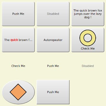
Now the app is displaying the two buttons:
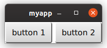
That’s it; you just created a QSkinny application from scratch.
For information on how the controls and layouts above behave, see the next chapters.
Layouts
Layouts manage the position of UI elements on the screen, and how the elements react to size changes (e.g. window resize).
Size hints
Size hints let the layouting code know how big UI elements are, and to which size they may shrink or grow.
Size hints can be explicit or implicit. Explicit sizes are set by the user via an API call through setExplicitSizeHint() ("This element is
of that size"), while implicit sizes are deduced from the elements themselves. Explicit size hints always take precedence over implicit ones.
For instance, the implicit size of a button is calculated from the text width (which itself depends on the font) and possibly padding and margins:
implicit horizontal size hint of a button
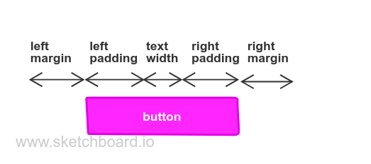
The implicit width of a composited UI element containing a graphic on the left and a text on the right would be the sum of the elements’ width, again with padding and margins.
Layouts, i.e. classes deriving from QskBox, are also controls (i.e. QskControl instances), so they also have size hints. A layout typically calculates its implicit size hint by summing up the size of its children. For instace a horizontal layout containing three buttons next to each other will calculate its implicit width by summing up the widths of the buttons (spacing and margins again come on top).
There are three types of size hints: Minimum, Preferred and Maximum.
- The minimum size hint of a UI element is used by layouting code to determine how small an element can be.
- The preferred size hint is the natural size of an element, and will be used in an ideal case, meaning there is enough space available.
- The maximum size hint is used by layouting code to determine how big an element can be.
Minimum and maximum size hints of atomic controls like QskPushButton or QskTextLabel are typically not used, instead size policies are used to express how small or big a component can be (see next topic). Minimum and maximum sizes, i.e. the methods minimumSize() and maximumSize(), are typically used for layouts though.
So in total, a control can have up to 6 size hints: the three types described above, and each one can have an implicit and an explicit hint.
Example
Below is an image with an implicit size hint with a width of 91 pixels and a height of 39 pixels (91x39). The hint is determined by the size of the text (71x19 pixels) plus margins (10 pixels each for top, right, bottom, left). We don’t need to set a size hint explicitly, the control will be rendered correctly with the implicit size hint:
control without explicit size hint

If we set an explicit size hint of 150x60 pixels ourselves for the preferred size, the control will be rendered differently:
control with explicit size hint
When dealing with standard controls or layouts, the size hints don’t need to be specified explicitly, as it can be deduced from its standard values, as seen in the example above.
The actual size of a UI element also depends on its size policy, see the next topic.
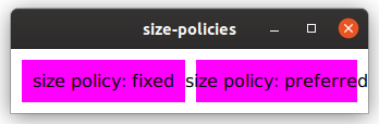
Size policies
Size policies define the way UI elements can change their size depending on the available space. Imagine a UI with a top bar and a main content area: When a status bar at the bottom is to be faded in, the top bar and main content have less space to display. One way to deal with this would be to leave the top bar at the same size and shrink the main area. This can be achieved with size policies: The top bar would have a vertical size policy of Fixed, while the main area would be Preferred, meaning it can grow and shrink.
The size policies of QSkinny correspond to the https://doc.qt.io/qt-5/qsizepolicy.html#Policy-enum[size policies from QtWidgets]:
QskSizePolicy::Policy | description |
|---|---|
Fixed | The control has a fixed size and can neither grow nor shrink. |
Minimum | The control cannot shrink beyond its minimum size, but it can grow if needed. |
Maximum | The control cannot grow beyond its maximum size, but it can shrink if needed. |
Preferred | The control can grow and shrink, but it should be of the size given by sizeHint(). |
MinimumExpanding | The control cannot shrink beyond its minimum size, but it can grow and should get as much space as possible. |
Expanding | The control can shrink and grow, and it should get as much space as possible. |
Ignored | The sizeHint() is ignored, and the control will get as much space as possible. |
Constrained | The size of the control depends on a constraint, i.e. the width is depending on the height or vice versa. For this policy and the other Constrained* ones below, QskControl::widthForHeight() or QskControl::heightForWidth() will be queried. |
ConstrainedMinimum | The size of the control depends on a constraint, but it can grow if needed. |
ConstrainedMaximum | The size of the control depends on a constraint, but it can shrink if needed. |
ConstrainedPreferred | The size of the control depends on a constraint, but it can grow and srhink if needed. |
ConstrainedMinimumExpanding | The size of the control depends on a constraint, but it can grow and should get as much space as possible. |
ConstrainedExpanding | The size of the control depends on a constraint, and it should get as much space as possible. |
All the Constrained* policies correspond to Qt’s QSizePolicy::hasHeightForWidth() or QSizePolicy::hasWidthForHeight() flag. E.g. if a control has a horizontal size policy of Constrained and a vertical size policy of Fixed, it will call widthForHeight() to determine the width that corresponds to the height.
Example
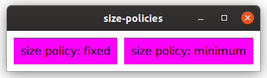
Below is an example of two buttons with different size policies. In this case only the horizontal size policies are considered; the vertical size policies behave correspondingly.
By default the width of the buttons is determined by its text plus its margins:
Size policies with preferred size
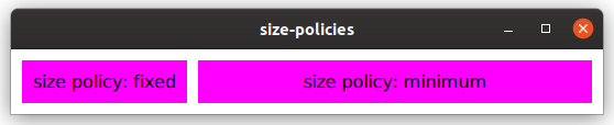
After growing the window horizontally, the button with the Fixed horizontal size policy keeps its width, while the button with the Minimum policy will grow:
Size policies when increasing window width
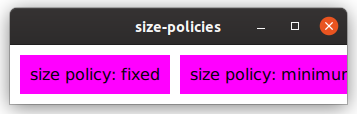
When shrinking the window below its original size, both buttons stay with their width: The one on the left because of its Fixed size policy, and the one on the right because it won’t shrink below its original size due to the Minimum size policy.
Size policies when shrinking window width
If we change the policy of the right button to Preferred, it will shrink below its original size (even though the text is too wide now):
Size policies when changing to preferred size policy
Types of layouts
There are different types of layouts that can group UI elements together. Internally, layouts use the layoutRect() method to determine the available space to place its children.
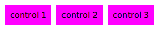
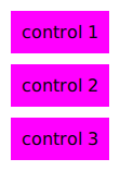
Linear layouts (QskLinearBox)
A linear layout can group elements either horizontally or vertically, as in the images below.
Horizontal layout
Vertical layout
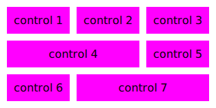
Grid layouts (QskGridBox)
Grid layouts are like linear layouts, but 2 dimensional, and support laying out UI controls in a grid, including spanning columns and rows.
Grid layout
Stack layouts (QskStackBox)
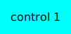
Stack layouts allow for items to be arranged on top of each other. Usually there is one current (visible) item, while the rest of the items are hidden below the current one:
Stack layout (symbolized)
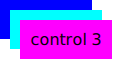
In this example, "control 3" is stacked on top of the blue and the cyan control. Controls in a stacked layout can be of different sizes.
NOTE: The image above is just for illustrating purposes. In practice the topmost control ("control 3" here) is completely covering the ones below it.
QskControl::autoLayoutChildren()
When the QskControl::autoLayoutChildren() flag is set, the control will recalculate the geometry of its children whenever the item is updating its layout.
Stretch factors
Stretch factors allow layouts to keep a size ratio for their elements. Let’s say a horizontal layout contains two elements, and when filling up additional space, the second element should always have twice the width of the first element. Then the first element should have a stretch factor of 1 and the second element a factor of 2.
Stretch factors are set on the layout rather than on the controls itself:
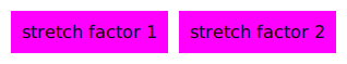
When the layout has all the space it needs (but not more), both elements are rendered with their preferred size:
Stretch factors with preferred size
When the layout gets more width, the stretch factors come into play:
A stretch factor of 1:2
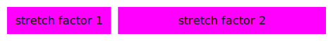
No matter how wide the layout is, the aspect ratio of 1:2 will always be kept, meaning that the label on the left will get 33% of the space, and the label on the right 67%:
A stretch factor of 1:2 with different widths

Stretch factors in QSkinny are the same as in the Qt Graphics View Framework, see https://doc.qt.io/qt-5/qgraphicslinearlayout.html#stretch-factor-in-qgraphicslinearlayout[Stretch Factor in QGraphicsLinearLayout].
Nesting layouts
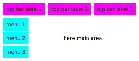
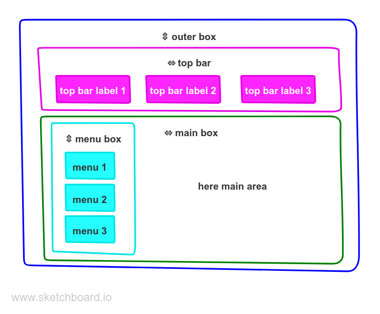
In a real-world application it is typical to nest several layouts in each other. The example below depicts a UI with a top bar and menu items on the left:
A UI with nested layouts
The code to produce the above UI could look like this (setting colors etc. omitted for brevity):
Here we have an outer vertical layout which divides the content into a top bar and a main box. The top bar itself consists of a horizontal layout with 3 buttons, while the main area is split into a left part with menu buttons and a right part for the main area. That left part with the menu buttons is again a vertical layout.
The following diagram makes the layouts visible:
The layout structure of the UI
Anchoring in QSkinny
TODO
Skins, Skin hints and Skinlets
Skins, Skin hints and Skinlets allow the user to define how specific controls looke like. Controls are drawn on the screen by the skinlet, and therefore it will read information from both the control itself as well as read the skin hints from the skin:
Skinlets query the control and the skin
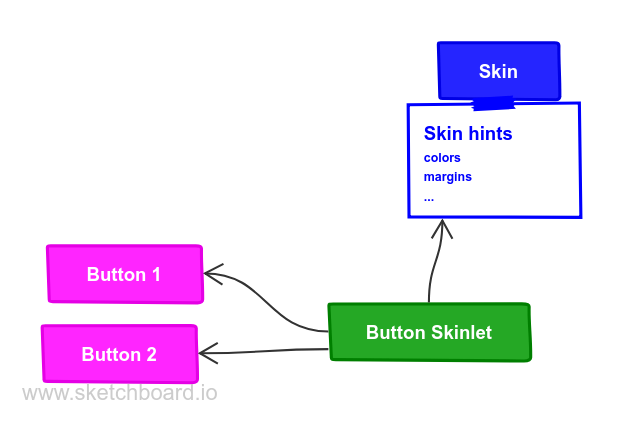
For instance, a button skinlet will read the margins from the skin and the text to render from the button.
Skins
Skins are a way to define a look and feel for a whole set of UI controls, e.g. a night time vs. day time skin, skins for different brands or an Android Material skin. They contain all kinds of properties (i.e. skin hints) like colors, margins, fonts and more.
The example below shows different implementations for a push button: One has a traditional desktop skin, the other is a flat button with a skin often found in mobile devices.
desktop style button

flat button

Skin hints
Each instance of a button will have unique properties like its text or icon file name, but all buttons will have common properties like the (default) background color and font size. These common properties are called skin hints, and are defined in a skin. Skin hints are either colors, e.g. the background color of a button, metrics (e.g. padding) or flags (e.g. text alignment).
Skin hints being part of a skin means that each skin can have different skin hints:
All buttons in a day time-like skin would have a light background color and dark text color, while a night time skin would have a dark background color and light text color by default.
Extending the MySkin example from above, here is an example of some skin hints for a push button, setting the padding to 10 pixels, the background color to magenta and the text color to black:
A button styled with skin hints

When writing a new skin, a developer needs to know which hints to set for which control. This usually depends on the control itself; however, since usually controls are broken down into the three primitives box, text and graphic, the methods for rendering each of them will take the following skin hints into account:
|======================================================================= |Primitive |Skin hint from QskAspect |Text |Alignment\ Color\ TextColor\ StyleColor\ LinkColor\ Style\ FontRole
|Graphic |Alignment\ GraphicRole
|Box | Margin\ Metric | Border\ Color | Border\ Color\ Metric | Shape |=======================================================================
Some special cases exist where elements other than the primitives above are used.
States and animations
Skin hints can also depend on the state a control is in: Buttons for instance can be in a Pressed or Hovered state. For such cases, skin hints cannot only be set on a subcontrol, but also be made dependent on a specific state. In the example below we define the background color of the button to be magenta in the default state and cyan in the Hovered state.
When dealing with states, QSkinny allows for animations between those (and other entities like skins). The example below adds a different color for the Hovered state and an animation when transitioning between the background colors. The duration is set to be one second (1000 milliseconds in the setAnimation() call below). Now when a user will hover over the button, there will be a smooth animation from magenta to cyan interpolating between the colors. Without the setAnimation() call, the button would just switch to magenta when hovered right away.
button in normal state

button in hovered state

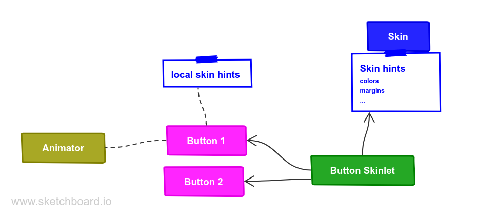
Local skin hints
It is possible to set local skin hints on specific controls to override skin-wide settings:
In general it is recommended to set the skin hints in the skin rather than on the control locally, in order to separate the style from the implementation, and to allow switching between skins. How to write controls that are themable is explained in the section about writing own controls.
Taking animations and local skin hints into account, the architecture diagram now looks like this:
Skinlets can also read from local skinlets and animators
Skinlets
A skinlet is in charge of drawing a control on the screen, similar to a Delegate in QML. It will read all the hints it needs from either the control itself or the skin, then it will draw the subcontrols that represent the control: In the sample case of a button, the skinlet will first draw the background panel, potentially consisting of a rectangle with a fill color. Then it will draw the text of the button, and last it will draw an icon, in case the button has one set.
Each skin can have a different skinlet to draw a control. Often the skinlet is the same across different skins and the skins only differ in skin hints, e.g. buttons having different fonts. However, it is also possible to have completely different skinlets per skin. This ensures a separation of application code instantiating the controls itself from the visual representation of the controls.
QSkinny already contains implementations of many common controls like text labels, buttons and so on. However, some custom controls might need to be written from scratch, including the skinlet; for an explanation on how to do this, see the example of writing own controls.
For a closer look at how the skinlet draws the controls in the scene graph, see scene graph representations of controls.
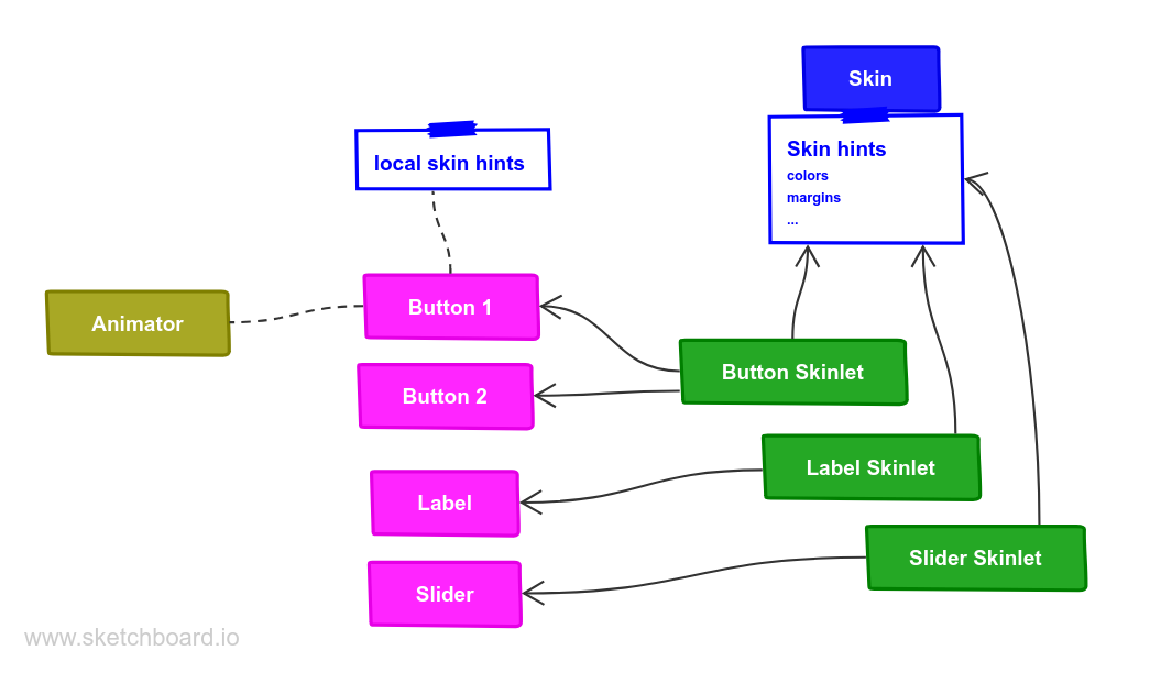
Of course each app has different controls and therefore there are also different skinlets, so a more complete version of the architecture diagram looks like this:
There is one skinlet for each atomic control
Skin factories and switching between skins
Skins are usually not created by the user directly, but by a skin factory. Such a factory keeps track of the skins registered in the system, and handles creating a new skin when the user switches them during application lifetime.
When having two skins called MySkin and OtherSkin in an app, the corresponding skin factory might look like this:
That skin factory has to be registered during app start; it is also a good idea to set a default skin right away:
Now we can define the OtherSkin and define different skin hints for e.g. push buttons. Here we define the background color and padding to be different; also we configure buttons to have a blue border:
Switching between skins will change the look of QskPushButton instances:
button in MySkin (as above)
button in OtherSkin

(Scalable) graphics
QSkinny offers support for scalable graphics, i.e. rendering SVGs that adapt to a specific size. This means that when a graphic is embedded in a layout, it can change its size when the layout is growing or shrinking, while still maintaining a correct aspect ratio.
Imagine the following code, which produces the image depicted below:
graphics with preferred size

When resizing the window, the graphics will scale according to the size available in the layout:
graphics bounded by width

graphics bounded by height
Since we set the horizontal size policy of the graphics to ConstrainedPreferred, the scaling is done through QskGraphic’s widthForHeight() methods to maintain the correct aspect ratio. If we had set the vertical policy to ConstrainedPreferred and the horizontal one to e.g. Expanding, the layout would have queried the heightForWidth() method instead.
Of course non-scalable graphics like PNGs and JPGs are also supported:
QSkinny - Using QSkinny and QML
Combining QSkinny and QML is possible: Since both QML elements and QSkinny controls derive from QQuickItem, they can be combined and arranged in a common app. The https://github.com/uwerat/qskinny/tree/master/examples/buttons[QSkinny buttons example] shows how QSkinny controls can be used from QML.
When using a QSkinny control, all the methods exposed as either properties, slots or invokables can be used in QML. For example, the QSkinny control QskLinearBox defines the following properties:
CMakeLists.txt
The QskLinearBox class is registered to QML as Qsk.LinearBox via Qt’s qmlRegisterType, so the exposed properties orientation and spacing can be used like this:
The full Buttons example is depicted below.
The buttons example shows how to mix QSkinny and QML
For more information on using C++ classes from QML, see the article about exposing attributes of {cpp} types to QML in the Qt documentation.
Writing own controls
Writing own controls is either done by subclassing or compositing an existing displayable control like QskTextLabel, or by writing a completely new class including a skinlet, which is typically derived directly from QskControl.
Subclassing existing controls
Let’s say an app is displaying a text label with a specific style at several different places, then it makes sense to subclass QskTextLabel and set the needed properties like font size etc. in the derived class:
A subclassed control with local skin hints
Then there is no need to set the margins and background color for every instance of the custom text label.
Making custom classes skinnable
To make custom classes like the TextLabel class above skinnable, we need to define our own subcontrols and style them in our skin, in contrast to setting the values directly in the class. To be able to set specific values for our TextLabel class that are different from the generic QskTextLabel, we need to define our own subcontrols and substitute the generic subcontrols for them in an overriden method effectiveSubcontrol():
When the skinlet is drawing a TextLabel instance, it queries it for its subcontrols through effectiveSubcontrol() in order to style them properly. Now that we substitute the QskTextLabel::Panel for our TextLabel::Panel, we can style it accordingly in our skin, so we don’t need to set the local skin hints in the constructor of TextLabel anymore.
A subclassed control with skin hints defined in the skin
The styling described above has the same effect as in the simpler example, but now the TextLabel control can be given a different style depending on the skin.
In our class we only set a custom skin hint for the panel, but as QskTextLabel also has a Text subcontrol, we could of course also define our own one for the text.
Compositing controls
Controls can also be composited; e.g. when writing a class with a text label on the left and a graphic on the right side, it could look like this:
This allows for easy instantiation of the class with a text and a file name for the graphic:
A composited control

Writing controls with a skinlet
QSkinny already comes with controls like text labels, list views, buttons etc. When there is a completely new control to be written that cannot be subclassed or composited, the skinlet for the class needs to be implemented as well.
Writing the class
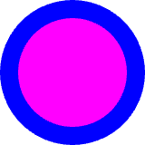
For demo purposes we create a class called CustomShape which shall display an outer circle and an inner circle, with minimal API. There are only 2 subcontrols that will be painted in the skinlet later:
Writing the skinlet
Writing the skinlet is the hard part of the work. We need the following things in our skinlet:
- A definition of node roles. They typically correspond to subcontrols from the control, so since in our case we have a subcontrol
PanelandInnerShape, there will be the node rolesPanelRoleandInnerShapeRole. The node roles are often set in the constructor of the class.
❗ IMPORTANT\ The constructor of the skinlet needs to be invokable!
- The enclosing rectangle for each subcontrol. This can be just the
contentsRect, but we can define it more accurately if we want by applying some metrics. If the code below is hard to understand, the important thing to take away from it is that different subcontrols can have different enclosing rectangles.
- The code to actually draw the nodes. In our case of an outer circle and an inner circle, the code for each subcontrol / node role is quite similar. The method
updateSubNode(), which is reimplemented fromQQuickItem, is called once for each node role. The code below again might not be straight forward to understand, the gist of it is that for each node role we draw a circle by creating aBoxNode.
Connecting class and skinlet
In our skin, we need to declare that the skinlet above will be responsible of drawing our control via declareSkinlet. Also, we can style our control with skin hints:
SkinFactories etc. are again omitted here. Finally we can draw our control; the effort might seem excessive, but we wrote the control with all capabilities of styling; in addition, the control will react to size changes properly. A simpler version with hardcoded values for margins, colors etc. can be written with less code.
A class with an own skinlet
Scene graph representations of controls
Each control that is displayed on the screen consists of one or more scene graph nodes. Those nodes can be either basic shapes like rectangles, or they can contain other information like positioning (used with transform nodes), opacity or clipping.
The source code below shows a minimal example displaying a button:
For this example, the scene graph will contain the following nodes:
Scene graph representation of a button
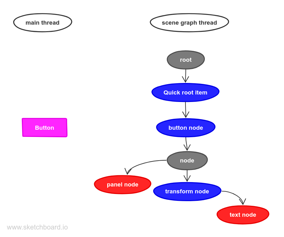
The top two nodes (root and Quick root item) are created for every QtQuick application. The button itself consists of 5 nodes in our case: One root note (button node), one node just to group its children (just labeled node), one geometry node for drawing the background (panel node), one transform node for setting the position of the text and another geometry node for displaying the text (text node).
For an explanation of the different scene graph node types, see the Qt documentation of QSGNode::NodeType.
The example above is the simplest form of a button, in practice there might be more nodes per control, for instance an opacity node or a clip node.
Now we add more elements to the UI by putting the button inside a layout (QskBox):
Then the scene graph has the following structure:
Scene graph representation of a button inside a box
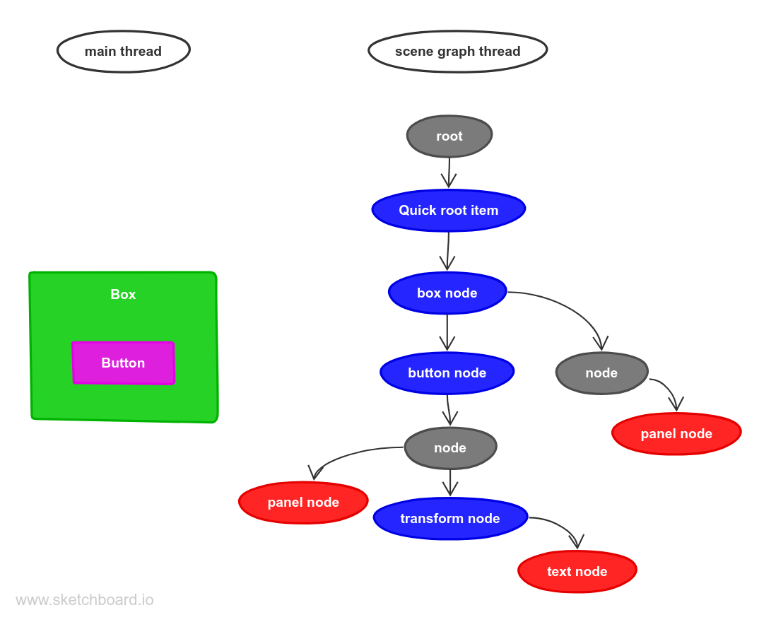
Here we can see that since the box is a parent of the button, the box node is also a parent of the button node in the scene graph. Also, the box has two child nodes: The button, which is the same as in the earlier example, and a node for the panel of the box, in case the panel itself has a background color.
In a more complicated UI with multiple elements and more advanced layouts, the number of scene graph nodes can be quite high. This is why QSkinny tries to create as little nodes as possible and reuse as many as it can.
Building QSkinny for WebAssembly (Wasm)
Build Qt for Wasm
Build Qt for Wasm from source as described here: https://doc.qt.io/qt-6/wasm.html#building-qt-from-source ; The verified Qt version for QSkinny as of this writing was 6.6.0. It might also work to use a downloaded version of Qt for Wasm, but some additional libraries will need to be built. After configuring Qt as described in the link above, for QSkinny you will need the qtbase, qtdeclarative, qtshadertools and qtsvg modules. Assuming the Emscripten SDK in ~/dev/emscripten and Qt in ~/dev/qt6, Qt can be compiled the following way:
This will install all required libs in ~/dev/qt6/qtbase/lib.
Build QSkinny for Wasm
With the Qt version from above QSkinny can be built for WAsm, assuming it has been checked out at ~/dev/qskinny. Note the configuration option BUILD_QSKDLL=OFF for static builds:
Run QSkinny for Wasm
Qt creates the HTML wrappers automatically, so there is not much to do except letting Emscripten start the server and open our app in the browser:
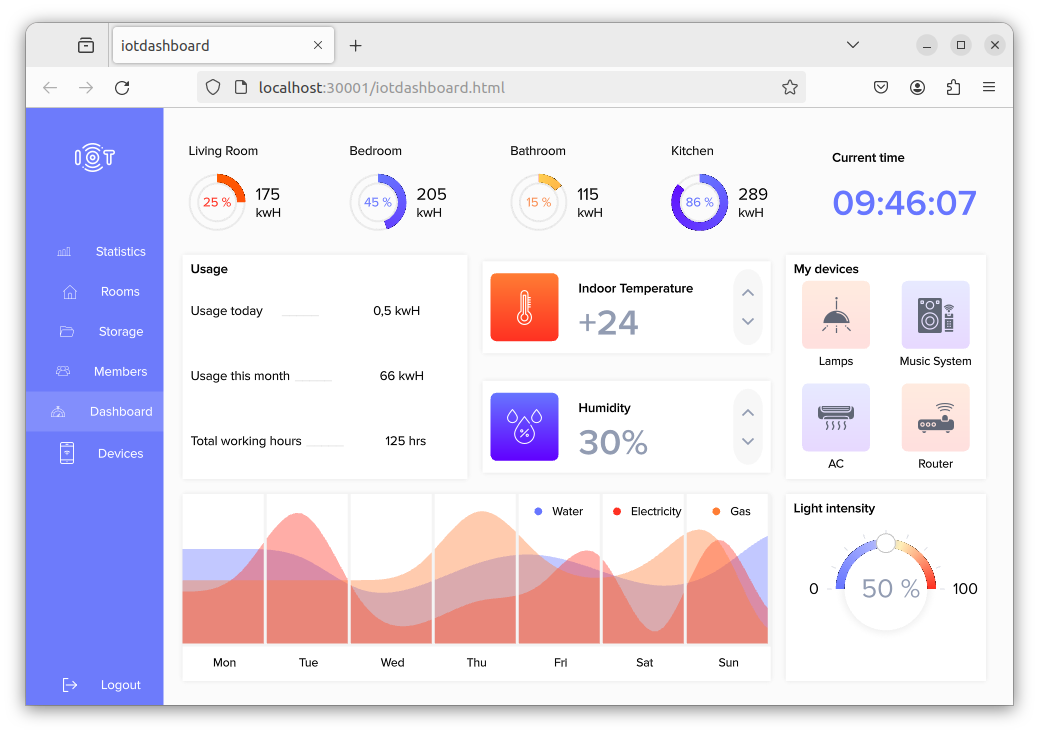
The IOT dashboard example in a browser