Layouts
Layouts manage the position of UI elements on the screen, and how the elements react to size changes (e.g. window resize).
Size hints
Size hints let the layouting code know how big UI elements are, and to which size they may shrink or grow.
Size hints can be explicit or implicit. Explicit sizes are set by the
user via an API call through setExplicitSizeHint() ("This element is
of that size''), while implicit sizes are deduced from the elements
themselves. Explicit size hints always take precedence over implicit
ones.
For instance, the implicit size of a button is calculated from the text width (which itself depends on the font) and possibly padding and margins:
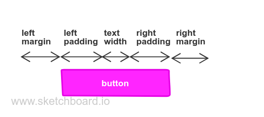
The implicit width of a composited UI element containing a graphic on the left and a text on the right would be the sum of the elements’ width, again with padding and margins.
Layouts, i.e. classes deriving from QskBox, are also controls
(i.e. QskControl instances), so they also have size hints. A layout
typically calculates its implicit size hint by summing up the size of
its children. For instace a horizontal layout containing three buttons
next to each other will calculate its implicit width by summing up the
widths of the buttons (spacing and margins again come on top).
There are three types of size hints: Minimum, Preferred and Maximum.
-
The minimum size hint of a UI element is used by layouting code to determine how small an element can be.
-
The preferred size hint is the natural size of an element, and will be used in an ideal case, meaning there is enough space available.
-
The maximum size hint is used by layouting code to determine how big an element can be.
Minimum and maximum size hints of atomic controls like QskPushButton
or QskTextLabel are typically not used, instead size policies are used
to express how small or big a component can be (see next topic).
Minimum and maximum sizes, i.e. the methods minimumSize() and
maximumSize(), are typically used for layouts though.
So in total, a control can have up to 6 size hints: the three types described above, and each one can have an implicit and an explicit hint.
Example
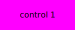
Below is an image with an implicit size hint with a width of 91 pixels and a height of 39 pixels (91x39). The hint is determined by the size of the text (71x19 pixels) plus margins (10 pixels each for top, right, bottom, left). We don’t need to set a size hint explicitly, the control will be rendered correctly with the implicit size hint:
auto* label1 = new QskTextLabel( "control 1" );
label1->setMargins( 10 );
label1->setBackgroundColor( Qt::magenta );
If we set an explicit size hint of 150x60 pixels ourselves for the preferred size, the control will be rendered differently:
label1->setExplicitSizeHint( Qt::PreferredSize, { 150, 60 } );
When dealing with standard controls or layouts, the size hints don’t need to be specified explicitly, as it can be deduced from its standard values, as seen in the example above.
The actual size of a UI element also depends on its size policy, see the next topic.
Size policies
Size policies define the way UI elements can change their size depending
on the available space. Imagine a UI with a top bar and a main content
area: When a status bar at the bottom is to be faded in, the top bar and
main content have less space to display. One way to deal with this would
be to leave the top bar at the same size and shrink the main area. This
can be achieved with size policies: The top bar would have a vertical
size policy of Fixed, while the main area would be Preferred,
meaning it can grow and shrink.
The size policies of QSkinny correspond to the size policies from QtWidgets:
QskSizePolicy::Policy |
description |
|---|---|
|
The control has a fixed size and can neither grow nor shrink. |
|
The control cannot shrink beyond its minimum size, but it can grow if needed. |
|
The control cannot grow beyond its maximum size, but it can shrink if needed. |
|
The control can grow and shrink, but it should be of the
size given by |
|
The control cannot shrink beyond its minimum size, but it can grow and should get as much space as possible. |
|
The control can shrink and grow, and it should get as much space as possible. |
|
The |
|
The size of the control depends on a constraint,
i.e. the width is depending on the height or vice versa. For this policy
and the other |
|
The size of the control depends on a constraint, but it can grow if needed. |
|
The size of the control depends on a constraint, but it can shrink if needed. |
|
The size of the control depends on a constraint, but it can grow and srhink if needed. |
|
The size of the control depends on a constraint, but it can grow and should get as much space as possible. |
|
The size of the control depends on a constraint, and it should get as much space as possible. |
All the Constrained* policies correspond to Qt’s
QSizePolicy::hasHeightForWidth()
or
QSizePolicy::hasWidthForHeight()
flag. E.g. if a control has a horizontal size policy of Constrained
and a vertical size policy of Fixed, it will call widthForHeight()
to determine the width that corresponds to the height.
Example
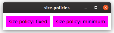
Below is an example of two buttons with different size policies. In this case only the horizontal size policies are considered; the vertical size policies behave correspondingly.
auto horizontalBox = new QskLinearBox( Qt::Horizontal );

auto* label1 = new QskTextLabel( "size policy: fixed" );
label1->setSizePolicy( Qt::Horizontal, QskSizePolicy::Fixed );
horizontalBox->addItem( label1 );

auto* label2 = new QskTextLabel( "size policy: minimum" );
label2->setSizePolicy( Qt::Horizontal, QskSizePolicy::Minimum );
horizontalBox->addItem( label2 );
...
By default the width of the buttons is determined by its text plus its margins:
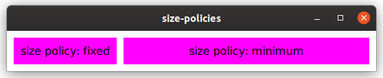
After growing the window horizontally, the button with the Fixed horizontal size policy keeps its width, while the button with the Minimum policy will grow:
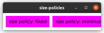
When shrinking the window below its original size, both buttons stay
with their width: The one on the left because of its Fixed size policy,
and the one on the right because it won’t shrink below its original size
due to the Minimum size policy.
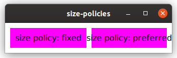
If we change the policy of the right button to Preferred, it will shrink
below its original size (even though the text is too wide now):
label2->setSizePolicy( Qt::Horizontal, QskSizePolicy::Preferred );
label2->setText( "size policy: preferred" );
Types of layouts
There are different types of layouts that can group UI elements
together. Internally, layouts use the layoutRect() method to determine
the available space to place its children.
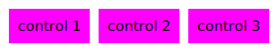
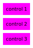
Linear layouts (QskLinearBox)
A linear layout can group elements either horizontally or vertically, as in the images below.
auto horizontalBox = new QskLinearBox( Qt::Horizontal );

auto* label1 = new QskTextLabel( "control 1" );
horizontalBox->addItem( label1 );

auto* label2 = new QskTextLabel( "control 2" );
horizontalBox->addItem( label2 );

auto* label3 = new QskTextLabel( "control 3" );
horizontalBox->addItem( label3 );
...
auto verticalBox = new QskLinearBox( Qt::Vertical );

auto* label1 = new QskTextLabel( "control 1" );
verticalBox->addItem( label1 );

auto* label2 = new QskTextLabel( "control 2" );
verticalBox->addItem( label2 );

auto* label3 = new QskTextLabel( "control 3" );
verticalBox->addItem( label3 );
...
Grid layouts (QskGridBox)
Grid layouts are like linear layouts, but 2 dimensional, and support laying out UI controls in a grid, including spanning columns and rows.
auto* gridBox = new QskGridBox;

auto* label1 = new QskTextLabel( "control 1" );
gridBox->addItem( label1, 0, 0 ); // last two arguments are row and column

auto* label2 = new QskTextLabel( "control 2" );
gridBox->addItem( label2, 0, 1 );

auto* label3 = new QskTextLabel( "control 3" );
gridBox->addItem( label3, 0, 2 );

auto* label4 = new QskTextLabel( "control 4" );
gridBox->addItem( label4, 1, 0, 1, 2 ); // additional arguments are rowSpan and columnSpan

auto* label5 = new QskTextLabel( "control 5" );
gridBox->addItem( label5, 1, 2 );

auto* label6 = new QskTextLabel( "control 6" );
gridBox->addItem( label6, 2, 0 );

auto* label7 = new QskTextLabel( "control 7" );
gridBox->addItem( label7, 2, 1, 1, 2 );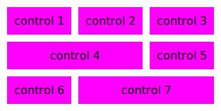
Stack layouts (QskStackBox)
Stack layouts allow for items to be arranged on top of each other. Usually there is one current (visible) item, while the rest of the items are hidden below the current one:
auto* stackBox = new QskStackBox;

auto* label1 = new QskTextLabel( "control 1" );
label1->setBackgroundColor( Qt::blue );
stackBox->addItem( label1 );

auto* label2 = new QskTextLabel( "control 2" );
label2->setBackgroundColor( Qt::cyan );
stackBox->addItem( label2 );

auto* label3 = new QskTextLabel( "control 3" );
label3->setBackgroundColor( Qt::magenta );
stackBox->addItem( label3 );

stackBox->setCurrentIndex( 2 );
...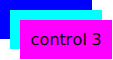
In this example, "control 3" is stacked on top of the blue and the cyan control. Controls in a stacked layout can be of different sizes.
|
Note
|
The image above is just for illustrating purposes. In practice the topmost control ("control 3" here) is completely covering the ones below it. |
QskControl::autoLayoutChildren()
When the QskControl::autoLayoutChildren() flag is set, the control will
recalculate the geometry of its children whenever the item is updating
its layout.
Stretch factors
Stretch factors allow layouts to keep a size ratio for their elements. Let’s say a horizontal layout contains two elements, and when filling up additional space, the second element should always have twice the width of the first element. Then the first element should have a stretch factor of 1 and the second element a factor of 2.
Stretch factors are set on the layout rather than on the controls itself:
auto horizontalBox = new QskLinearBox( Qt::Horizontal );
auto* label1 = new QskTextLabel( "stretch factor 1" );
horizontalBox->addItem( label1 );
horizontalBox->setStretchFactor( label1, 1 );
auto* label2 = new QskTextLabel( "stretch factor 2" );
horizontalBox->addItem( label2 );
horizontalBox->setStretchFactor( label2, 2 );
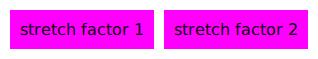
...When the layout has all the space it needs (but not more), both elements are rendered with their preferred size:
When the layout gets more width, the stretch factors come into play:
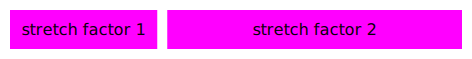
No matter how wide the layout is, the aspect ratio of 1:2 will always be kept, meaning that the label on the left will get 33% of the space, and the label on the right 67%:

Stretch factors in QSkinny are the same as in the Qt Graphics View Framework, see Stretch Factor in QGraphicsLinearLayout.
Nesting layouts
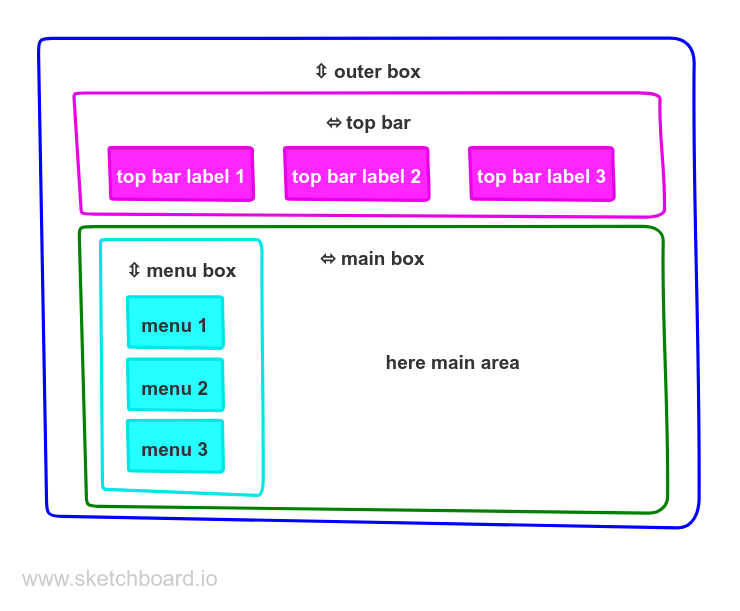
In a real-world application it is typical to nest several layouts in each other. The example below depicts a UI with a top bar and menu items on the left:
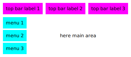
The code to produce the above UI could look like this (setting colors etc. omitted for brevity):
auto* outerBox = new QskLinearBox( Qt::Vertical );

auto* topBar = new QskLinearBox( Qt::Horizontal, outerBox );

auto* topLabel1 = new QskTextLabel( "top bar label 1", topBar );
auto* topLabel2 = new QskTextLabel( "top bar label 2", topBar );
auto* topLabel3 = new QskTextLabel( "top bar label 3", topBar );

auto* mainBox = new QskLinearBox( Qt::Horizontal, outerBox );

auto* menuBox = new QskLinearBox( Qt::Vertical, mainBox );

auto* menuLabel1 = new QskTextLabel( "menu 1", menuBox );
auto* menuLabel2 = new QskTextLabel( "menu 2", menuBox );
auto* menuLabel3 = new QskTextLabel( "menu 3", menuBox );

auto* mainText = new QskTextLabel( "here main area", mainBox );
...
Here we have an outer vertical layout which divides the content into a top bar and a main box. The top bar itself consists of a horizontal layout with 3 buttons, while the main area is split into a left part with menu buttons and a right part for the main area. That left part with the menu buttons is again a vertical layout.
The following diagram makes the layouts visible:
Anchoring in QSkinny
TODO