Skins, Skin hints and Skinlets
Skins, Skin hints and Skinlets allow the user to define how specific controls looke like. Controls are drawn on the screen by the skinlet, and therefore it will read information from both the control itself as well as read the skin hints from the skin:
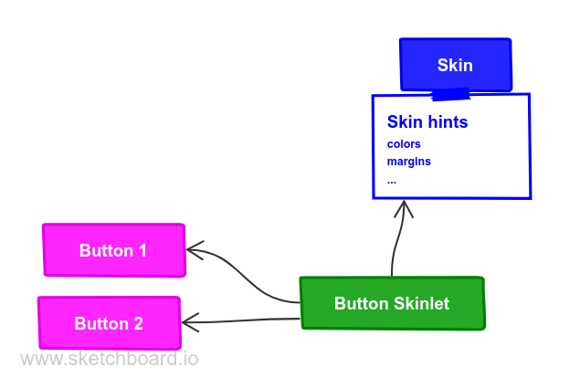
For instance, a button skinlet will read the margins from the skin and the text to render from the button.
Skins
Skins are a way to define a look and feel for a whole set of UI controls, e.g. a night time vs. day time skin, skins for different brands or an Android Material skin. They contain all kinds of properties (i.e. skin hints) like colors, margins, fonts and more.
class MySkin : public QskSkin
{

public:
    MySkin( QObject* parent = nullptr ) : QskSkin( parent )
    {
        // here define the skin with skin hints
    }
};
The example below shows different implementations for a push button: One has a traditional desktop skin, the other is a flat button with a skin often found in mobile devices.


Skin hints
Each instance of a button will have unique properties like its text or icon file name, but all buttons will have common properties like the (default) background color and font size. These common properties are called skin hints, and are defined in a skin. Skin hints are either colors, e.g. the background color of a button, metrics (e.g. padding) or flags (e.g. text alignment).
Skin hints being part of a skin means that each skin can have different skin hints:
All buttons in a day time-like skin would have a light background color and dark text color, while a night time skin would have a dark background color and light text color by default.
Extending the MySkin example from above, here is an example of some
skin hints for a push button, setting the padding to 10 pixels, the
background color to magenta and the text color to black:
class MySkin : public QskSkin
{

public:
    MySkin( QObject* parent = nullptr ) : QskSkin( parent )
    {
        setGradient( QskPushButton::Panel, Qt::magenta );
        setMargins( QskPushButton::Panel | QskAspect::Padding, 10 );
        setColor( QskPushButton::Text, Qt::black );
    }
};
When writing a new skin, a developer needs to know which hints to set for which control. This usually depends on the control itself; however, since usually controls are broken down into the three primitives box, text and graphic, the methods for rendering each of them will take the following skin hints into account:
| Primitive | Skin hint from QskAspect |
|---|---|
Text |
|
Graphic |
|
Box |
|
Some special cases exist where elements other than the primitives above are used.
States and animations
Skin hints can also depend on the state a control is in: Buttons for
instance can be in a Pressed or Hovered state. For such cases, skin
hints cannot only be set on a subcontrol, but also be made dependent on
a specific state. In the example below we define the background color of
the button to be magenta in the default state and cyan in the Hovered
state.
When dealing with states, QSkinny allows for animations between those (and other entities
like skins). The example below adds a different color for the Hovered
state and an animation when transitioning between the background colors.
The duration is set to be one second (1000 milliseconds in the
setAnimation() call below). Now when a user will hover over the
button, there will be a smooth animation from magenta to cyan
interpolating between the colors. Without the setAnimation() call, the
button would just switch to magenta when hovered right away.
class MySkin : public QskSkin
{

public:
    MySkin( QObject* parent = nullptr ) : QskSkin( parent )
    {
        setGradient( QskPushButton::Panel, Qt::magenta );
        setMargins( QskPushButton::Panel | QskAspect::Padding, 10 );
        setColor( QskPushButton::Text, Qt::black );

        setGradient( QskPushButton::Panel | QskPushButton::Hovered, Qt::cyan );
        setAnimation( QskPushButton::Panel | QskAspect::Color, 1000 );
    }
};

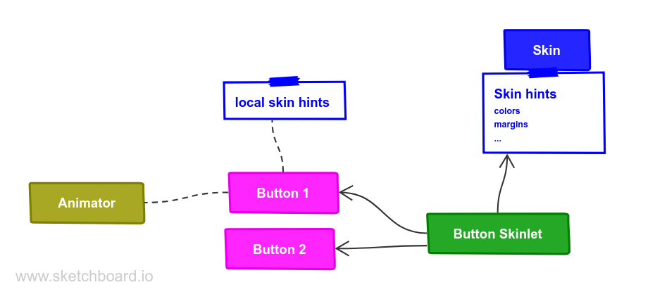
Local skin hints
It is possible to set local skin hints on specific controls to override skin-wide settings:
auto* label1 = new QskTextLabel( "control 1" );
label1->setMargins( 20 );
label1->setBackgroundColor( Qt::blue );
In general it is recommended to set the skin hints in the skin rather than on the control locally, in order to separate the style from the implementation, and to allow switching between skins. How to write controls that are themable is explained in the section about writing own controls.
Taking animations and local skin hints into account, the architecture diagram now looks like this:
Skinlets
A skinlet is in charge of drawing a control on the screen, similar to a Delegate in QML. It will read all the hints it needs from either the control itself or the skin, then it will draw the subcontrols that represent the control: In the sample case of a button, the skinlet will first draw the background panel, potentially consisting of a rectangle with a fill color. Then it will draw the text of the button, and last it will draw an icon, in case the button has one set.
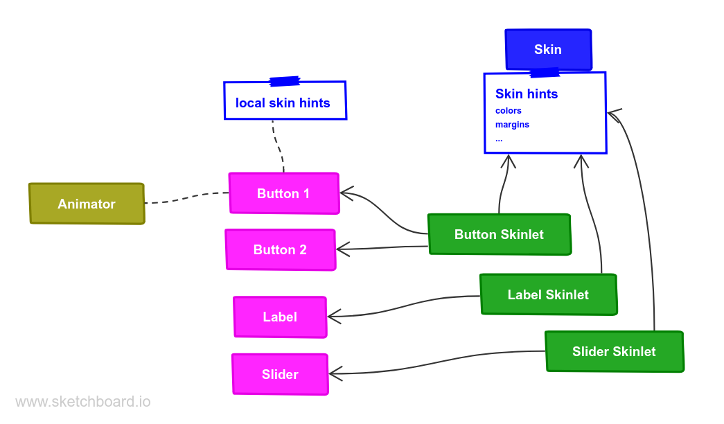
Each skin can have a different skinlet to draw a control. Often the skinlet is the same across different skins and the skins only differ in skin hints, e.g. buttons having different fonts. However, it is also possible to have completely different skinlets per skin. This ensures a separation of application code instantiating the controls itself from the visual representation of the controls.
QSkinny already contains implementations of many common controls like text labels, buttons and so on. However, some custom controls might need to be written from scratch, including the skinlet; for an explanation on how to do this, see the example of writing own controls.
For a closer look at how the skinlet draws the controls in the scene graph, see scene graph representations of controls.
Of course each app has different controls and therefore there are also different skinlets, so a more complete version of the architecture diagram looks like this:
Skin factories and switching between skins
Skins are usually not created by the user directly, but by a skin factory. Such a factory keeps track of the skins registered in the system, and handles creating a new skin when the user switches them during application lifetime.
When having two skins called MySkin and OtherSkin in an app, the
corresponding skin factory might look like this:
class MySkinFactory : public QskSkinFactory
{

    Q_OBJECT

public:
    QStringList skinNames() const override
    {
        return { "MySkin", "OtherSkin" };
    }

    QskSkin* createSkin( const QString& skinName ) override
    {
        if ( skinName == "MySkin" )
            return new MySkin;

        if ( skinName == "OtherSkin" )
            return new OtherSkin;

        return nullptr;
    }
};
That skin factory has to be registered during app start; it is also a good idea to set a default skin right away:
int main( int argc, char* argv[] )
{
    auto* skinFactory = new MySkinFactory;
    qskSkinManager->registerFactory( "MySkinFactory", skinFactory );

    QGuiApplication app( argc, argv );

    qskSetup->setSkin( "MySkin" );

    ...
    QskWindow window;
    window.show();

    return app.exec();
}
Now we can define the OtherSkin and define different skin hints for
e.g. push buttons. Here we define the background color and padding to be
different; also we configure buttons to have a blue border:
class OtherSkin : public QskSkin
{

public:
    OtherSkin( QObject* parent = nullptr ) : QskSkin( parent )
    {
        setGradient( QskPushButton::Panel, Qt::cyan );
        setMargins( QskPushButton::Panel | QskAspect::Padding, 15 );
        setBoxBorderColors( QskPushButton::Panel, Qt::blue );
        setBoxBorderMetrics( QskPushButton::Panel, 1 );
    }
};
Switching between skins will change the look of QskPushButton
instances:
MySkin (as above)
OtherSkin