Writing own controls
Writing own controls is either done by subclassing or compositing an
existing displayable control like QskTextLabel, or by writing a
completely new class including a skinlet, which is typically derived
directly from QskControl.
Subclassing existing controls
Let’s say an app is displaying a text label with a specific style at
several different places, then it makes sense to subclass QskTextLabel
and set the needed properties like font size etc. in the derived class:
class TextLabel : public QskTextLabel
{

    Q_OBJECT

public:
    TextLabel( const QString& text, QQuickItem* parent = nullptr ) : QskTextLabel( text, parent )
    {
        setMargins( 15 );
        setBackgroundColor( Qt::cyan );
    }
};
Then there is no need to set the margins and background color for every instance of the custom text label.
Making custom classes skinnable
To make custom classes like the TextLabel class above skinnable, we
need to define our own subcontrols and style them in our skin, in
contrast to setting the values directly in the class. To be able to set
specific values for our TextLabel class that are different from the
generic QskTextLabel, we need to define our own subcontrols and
substitute the generic subcontrols for them in an overriden method
effectiveSubcontrol():
class TextLabel : public QskTextLabel
{
    QSK_SUBCONTROLS( Panel )

    TextLabel( const QString& text, QQuickItem* parent = nullptr ) : QskTextLabel( text, parent )
    {
    }

    QskAspect::Subcontrol effectiveSubcontrol( QskAspect::Subcontrol subControl ) const override final
    {
        if ( subControl == QskTextLabel::Panel )
            return TextLabel::Panel;

        return subControl;
    }
    ...
}
When the skinlet is drawing a TextLabel instance, it queries it for
its subcontrols through effectiveSubcontrol() in order to style them
properly. Now that we substitute the QskTextLabel::Panel for our
TextLabel::Panel, we can style it accordingly in our skin, so we don’t
need to set the local skin hints in the constructor of TextLabel
anymore.
class MySkin : public QskSkin
{

public:
    MySkin( QObject* parent = nullptr ) : QskSkin( parent )
    {
        setGradient( TextLabel::Panel, Qt::cyan );
        setMargins( TextLabel::Panel | QskAspect::Padding, 15 );
    }
};The styling described above has the same effect as in the simpler
example, but now the TextLabel control can be given a different style
depending on the skin.
In our class we only set a custom skin hint for the panel, but as
QskTextLabel also has a Text subcontrol, we could of course also
define our own one for the text.
Compositing controls
Controls can also be composited; e.g. when writing a class with a text label on the left and a graphic on the right side, it could look like this:
class TextAndGraphic : public QskLinearBox
{

    Q_OBJECT

public:
    TextAndGraphic( const QString& text, const QString& graphicName, QQuickItem* parent = nullptr )
        : QskLinearBox( Qt::Horizontal, parent ),
          m_textLabel( new QskTextLabel( text, this ) )
    {
        addItem( m_textLabel );

        QImage image( QString( ":/images/%1.svg" ).arg( graphicName ) );
        auto graphic = QskGraphic::fromImage( image );

        m_graphicLabel = new QskGraphicLabel( graphic );
        m_graphicLabel->setExplicitSizeHint( Qt::PreferredSize, { 30, 30 } );
        addItem( m_graphicLabel );

        setAutoLayoutChildren( true );
        ...
    }

private:
    QskTextLabel* m_textLabel;
    QskGraphicLabel* m_graphicLabel;
};
This allows for easy instantiation of the class with a text and a file name for the graphic:
auto* textAndGraphic = new TextAndGraphic( "Text", "cloud" );
Writing controls with a skinlet
QSkinny already comes with controls like text labels, list views, buttons etc. When there is a completely new control to be written that cannot be subclassed or composited, the skinlet for the class needs to be implemented as well.
Writing the class
For demo purposes we create a class called CustomShape which shall
display an outer circle and an inner circle, with minimal API. There are
only 2 subcontrols that will be painted in the skinlet later:
class CustomShape : public QskControl
{
    Q_OBJECT

public:
    QSK_SUBCONTROLS( Panel, InnerShape )

    CustomShape( QQuickItem* parent = nullptr ) : QskControl( parent )
    {
    }
};
Writing the skinlet
Writing the skinlet is the hard part of the work. We need the following things in our skinlet:
-
A definition of node roles. They typically correspond to subcontrols from the control, so since in our case we have a subcontrol
PanelandInnerShape, there will be the node rolesPanelRoleandInnerShapeRole. The node roles are often set in the constructor of the class.
|
Important
|
The constructor of the skinlet needs to be invokable! |
class CustomShapeSkinlet : public QskSkinlet
{
    Q_GADGET

public:
    enum NodeRole
    {
        PanelRole, InnerShapeRole
    };

    Q_INVOKABLE CustomShapeSkinlet( QskSkin* skin = nullptr ) : QskSkinlet( skin )
    {
        setNodeRoles( { PanelRole, InnerShapeRole } );
}-
The enclosing rectangle for each subcontrol. This can be just the
contentsRect, but we can define it more accurately if we want by applying some metrics. If the code below is hard to understand, the important thing to take away from it is that different subcontrols can have different enclosing rectangles.
    QRectF subControlRect( const QskSkinnable* skinnable, const QRectF& contentsRect, QskAspect::Subcontrol subControl ) const override
    {
        const auto* customShape = static_cast< const CustomShape* >( skinnable );

        if ( subControl == CustomShape::Panel )
        {
            return contentsRect;
        }
        else if ( subControl == CustomShape::InnerShape )
        {
            const auto margins = customShape->marginsHint( CustomShape::InnerShape );
            return contentsRect.marginsRemoved( margins );
        }

return QskSkinlet::subControlRect( skinnable, contentsRect, subControl );-
The code to actually draw the nodes. In our case of an outer circle and an inner circle, the code for each subcontrol / node role is quite similar. The method
updateSubNode(), which is reimplemented fromQQuickItem, is called once for each node role. The code below again might not be straight forward to understand, the gist of it is that for each node role we draw a circle by creating aBoxNode.
protected:
    QSGNode* updateSubNode( const QskSkinnable* skinnable, quint8 nodeRole, QSGNode* node ) const override
    {
        const auto* customShape = static_cast< const CustomShape* >( skinnable );

        switch ( nodeRole )
        {
            case PanelRole:
            {
                auto panelNode = static_cast< QskBoxNode* >( node );

                ...
                const auto panelRect = subControlRect( customShape, customShape->contentsRect(), CustomShape::Panel );
                const qreal radius = panelRect.width() / 2;
                panelNode->setBoxData( panelRect, shapeMetrics, borderMetrics, borderColors, gradient );

                return panelNode;
            }
            case InnerShapeRole:
            {
                auto innerNode = static_cast< QskBoxNode* >( node );

                ...
                const auto innerRect = subControlRect( customShape, customShape->contentsRect(), CustomShape::InnerShape );
                const qreal radius = innerRect.width() / 2;
                innerNode->setBoxData( innerRect, shapeMetrics, borderMetrics, borderColors, gradient );

                return innerNode;
            }
        }

        return QskSkinlet::updateSubNode( skinnable, nodeRole, node );
    }
};
Connecting class and skinlet
In our skin, we need to declare that the skinlet above will be
responsible of drawing our control via declareSkinlet. Also, we can
style our control with skin hints:
class MySkin : public QskSkin
{
public:
MySkin( QObject* parent = nullptr ) : QskSkin( parent )
{
declareSkinlet< CustomShape, CustomShapeSkinlet >();
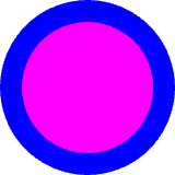
setGradient( CustomShape::Panel, Qt::blue );
setMargins( CustomShape::InnerShape, 20 );
setGradient( CustomShape::InnerShape, Qt::magenta );
}
};SkinFactories etc. are again omitted here. Finally we can draw our control; the effort might seem excessive, but we wrote the control with all capabilities of styling; in addition, the control will react to size changes properly. A simpler version with hardcoded values for margins, colors etc. can be written with less code.